

166
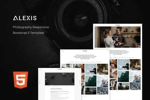
Alexis – Photography Responsive Bootstrap Template
1 ₫
Unleash your creativity with Alexis, a responsive photography Bootstrap template designed for both budding and seasoned photographers. With its sleek design and user-friendly interface, you can effortlessly showcase your work across seven beautifully crafted HTML pages, including portfolios and blogs. Each feature is optimized for all devices and browsers, ensuring that your stunning visuals shine brightly everywhere. Enjoy seamless customization, lifetime updates, and outstanding support as you build your perfect online portfolio.
Alexis – Photography Responsive Bootstrap Template
Alexis is a meticulously crafted responsive photography Bootstrap template designed to empower photographers at every skill level. Whether you’re just starting your journey or a seasoned professional, Alexis offers a polished platform to showcase your artistry with elegance and ease. Built on the reliable Bootstrap framework, this template guarantees a flawless viewing experience across all devices and browsers—meaning your portfolio will look stunning whether viewed on a smartphone, tablet, or desktop. What truly sets Alexis apart is its seamless combination of sleek, modern design with a user-friendly interface. Spread across seven beautifully designed HTML pages, including thoughtfully organized portfolios and engaging blog layouts, Alexis makes sharing your visual story effortless and appealing. Additionally, the template offers extensive customization options, allowing you to tailor colors, fonts, and layouts to perfectly match your brand identity. With lifetime updates and dedicated support included, Alexis ensures that your online portfolio remains cutting-edge and hassle-free as your photography career grows.
Key Features
- Responsive Design: Ensures flawless display on all devices and screen sizes, providing an optimal user experience whether on mobile, tablet, or desktop.
- Bootstrap Framework: Built on the popular and robust Bootstrap platform for easy customization and reliable performance.
- Seven Unique HTML Pages: Includes portfolio layouts, blog sections, about pages, and contact forms to fully showcase your work and engage your audience.
- Clean and Modern Aesthetic: Sleek, minimalist design highlights your photography without distractions, keeping visitor focus on your stunning visuals.
- SEO-Optimized Code: Boosts your site’s search engine rankings, making it easier for potential clients to find your portfolio online.
- Cross-Browser Compatibility: Tested across all major browsers to guarantee consistent functionality and appearance.
- Easy Customization: User-friendly options to adjust colors, typography, and layouts to create a unique online presence that reflects your style.
- Blog Integration: Share your stories, tips, and updates seamlessly with built-in blog templates that keep your audience engaged.
- Contact Forms Included: Built-in, ready-to-use contact forms make it simple for potential clients to reach out directly.
- Lifetime Updates and Support: Receive ongoing improvements and dedicated assistance to keep your template running smoothly.
Hãy là người đầu tiên nhận xét “Alexis – Photography Responsive Bootstrap Template”
Sản phẩm tương tự

HTML Template
1 ₫

Email Templates
1 ₫


HTML Template
1 ₫

React Template
1 ₫


1 ₫

1 ₫


HTML Template
1 ₫

1 ₫

1 ₫
Đánh giá
Chưa có đánh giá nào.