

171
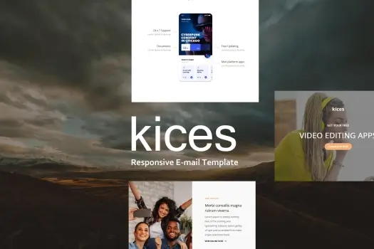
kices Mail – Responsive E-mail Template
1 ₫
Kices Mail is a versatile and responsive email template designed to elevate your communication. With its clean, modern layout and user-friendly features, you can easily customize it for any occasion, from newsletters to promotions. Compatible with various email clients, it ensures your messages look great on any device, making it perfect for businesses looking to connect with their audience effectively.
kices Mail – Responsive E-mail Template
Kices Mail is a meticulously crafted responsive email template designed to take your email marketing and communications to the next level. Whether you’re sending newsletters, promotional campaigns, or important business announcements, Kices Mail offers a clean, modern, and highly adaptable layout that seamlessly fits any content type. Its design prioritizes readability and engagement, ensuring your message resonates with your audience across all devices and email clients. What sets Kices Mail apart is its exceptional compatibility and ease of customization. Built with a mobile-first approach, this template looks flawless on smartphones, tablets, and desktops alike, eliminating the frustration of broken layouts or unreadable designs. Its flexible structure lets you personalize colors, fonts, images, and content blocks quickly, giving you full creative control without needing extensive coding knowledge. Businesses of all sizes can harness Kices Mail to maintain a consistent, professional brand presence while delivering compelling and effective communications that boost customer engagement and conversions.
Key Features
- Responsive Design – Ensures your emails display perfectly on any device, from mobile phones to desktops, enhancing user experience and engagement.
- Cross-Client Compatibility – Tested and optimized for all major email clients, including Gmail, Outlook, Apple Mail, and Yahoo, guaranteeing consistent appearance everywhere.
- Easy Customization – Simple to edit colors, fonts, images, and layout sections, allowing you to tailor your messages swiftly to match your brand identity and campaign goals.
- Modular Layout – Designed with flexible content blocks so you can easily add, remove, or rearrange sections to create personalized email structures without hassle.
- Clean & Modern Aesthetic – Minimalist design that keeps your content front and center, promoting professionalism and readability that appeals to a wide audience.
- Well-Commented Code – Developer-friendly markup makes it easy for technical users to tweak and extend the template functionality as needed.
- Optimized Load Times – Lightweight code ensures fast email load times, keeping recipients engaged and reducing bounce rates.
- Retina Ready – High-resolution assets deliver crisp visuals on high-DPI screens, offering a polished and premium look.
- Inline CSS Styling – Guarantees email styling consistency across platforms by embedding styles directly within HTML elements.
Hãy là người đầu tiên nhận xét “kices Mail – Responsive E-mail Template”
Sản phẩm tương tự

Email Templates
1 ₫

Email Templates
1 ₫

Email Templates
1 ₫


HTML Template
1 ₫

1 ₫

1 ₫

Email Templates
1 ₫


HTML Template
1 ₫


Email Templates
1 ₫

1 ₫

Email Templates
1 ₫
Đánh giá
Chưa có đánh giá nào.